

Lexington Endodontics is a premier destination for root canal treatments.
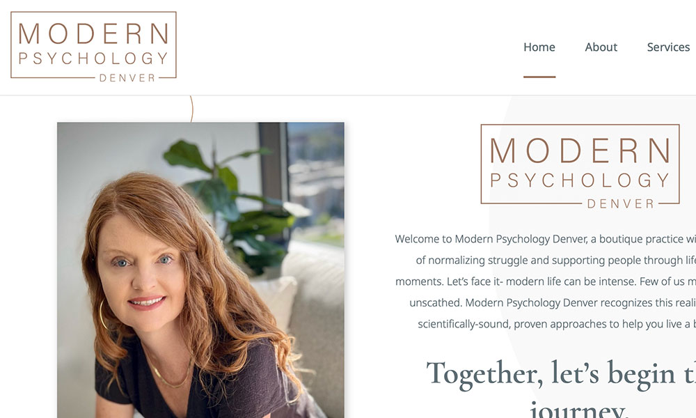
Modern Psychology is a boutique psychology office located in Denver, CO.
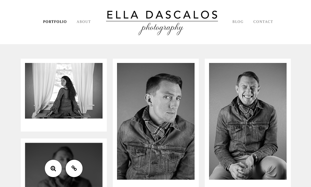
Ella Dascalos is a lifestyle photographer located in Denver, CO.
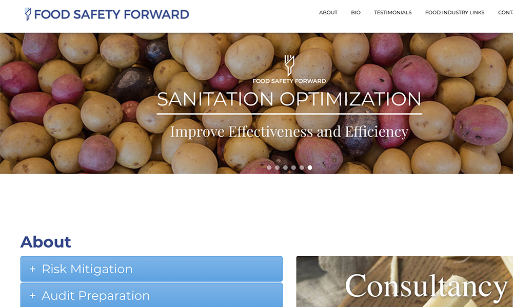
Food Safety Forward is a business that provides food safety consultation to food and beverage manufactures.
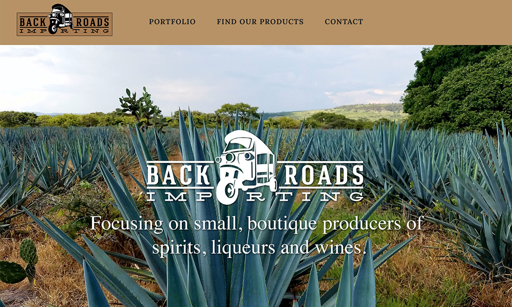
Back Roads Importing focuses on small, boutique producers of spirits, liqueurs and wines globally.
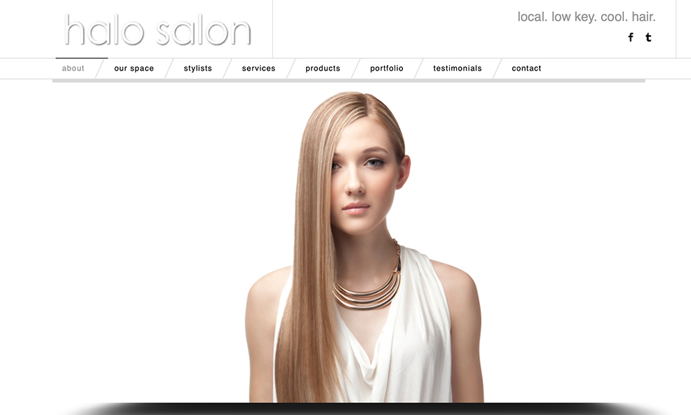
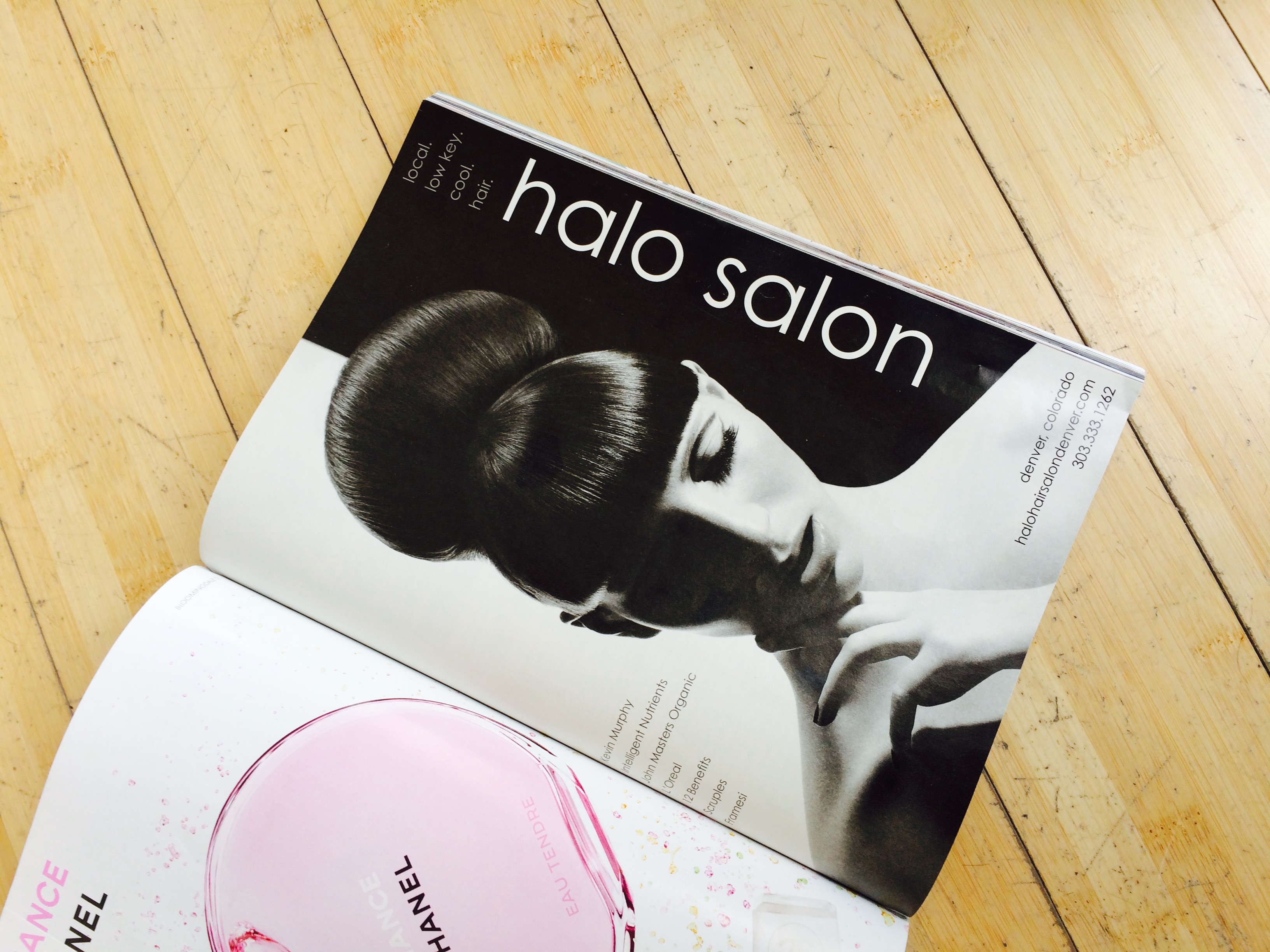
Halo Salon is a local and low key hair salon located in Denver, CO.
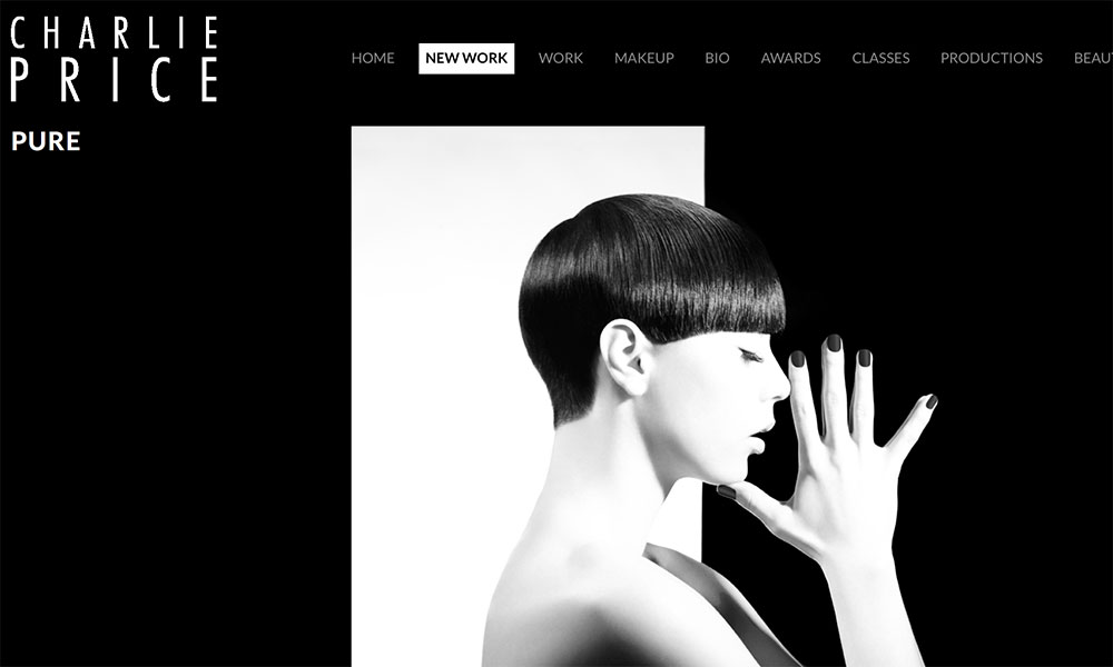
Charlie Price is one of the most recognizable faces in the North American salon industry.
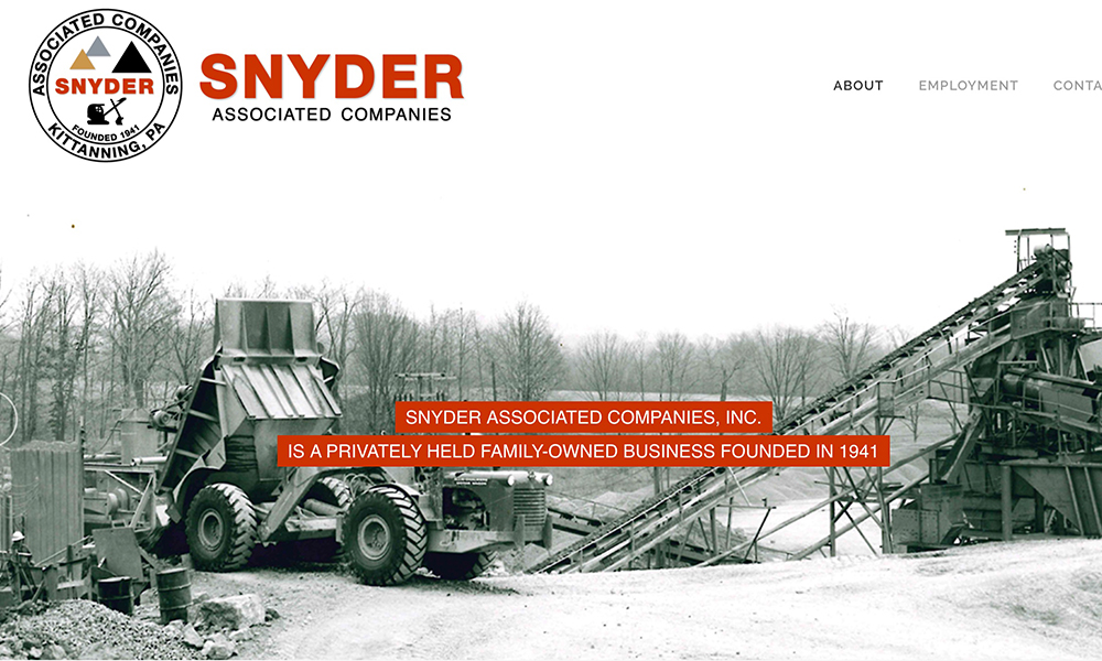
Snyder Associated Companies, Inc. is a family-owned business focusing on mining, oil and gas exploration and production, manufacturing and agricultural.
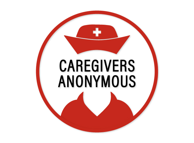
Caregivers Anonymous is a podcast which discusses all aspects of caregiving. Highlighting on the idea that this role consists of many hidden and thankless responsibilities. I starkly juxtaposed commonly recognized caregiving icons including the nurse’s cap and the cross with a faceless figure. This conveys an intriguing feeling of comfort and tension.
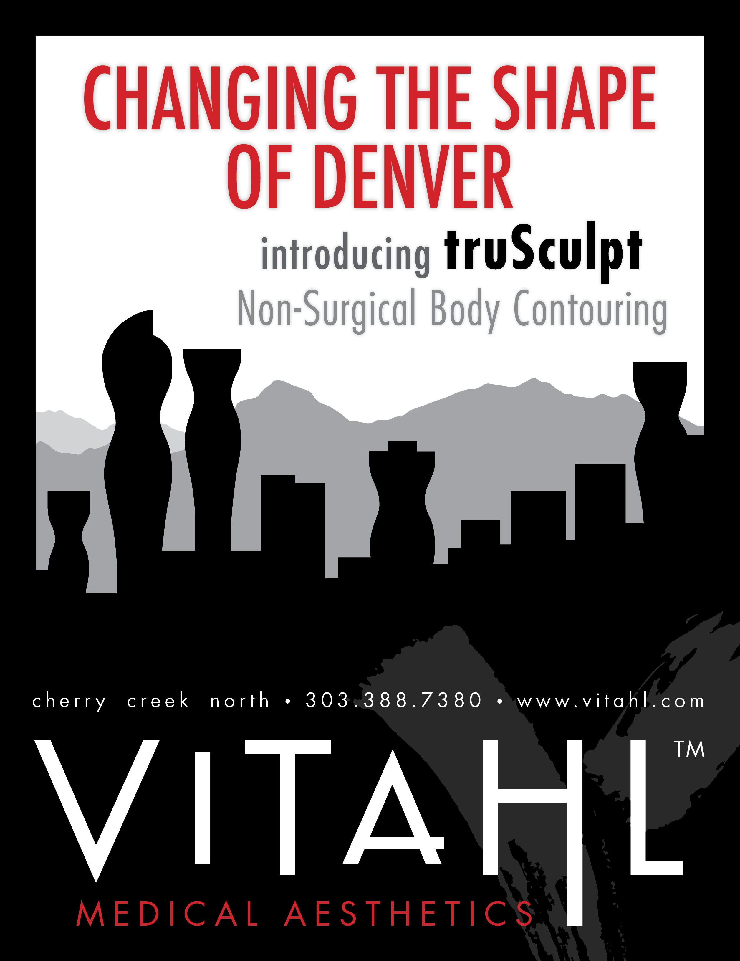
Body Contouring Ad
I was asked to create an ad for body contouring using the headline “Changing the Shape of Denver”, so I added a curvy shape to the buildings in the Denver skyline.
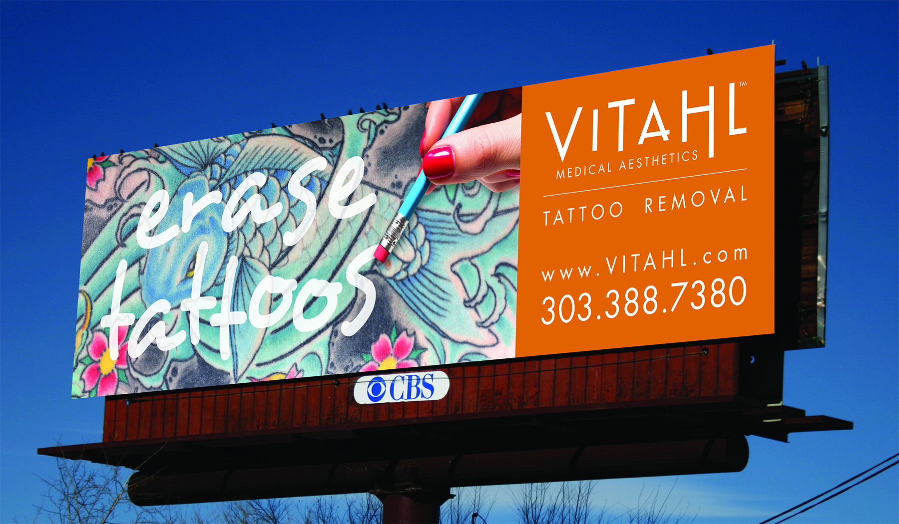
Tattoo Removal Ad Campaign
My client requested a bold look for a laser tattoo removal billboard using the tagline “erase tattoos”. I knew that a colorful tattoo closeup would create a powerful image in large format, so in contrast, I decided to add a playful quality by illustrating a pencil erasing the tattoo.
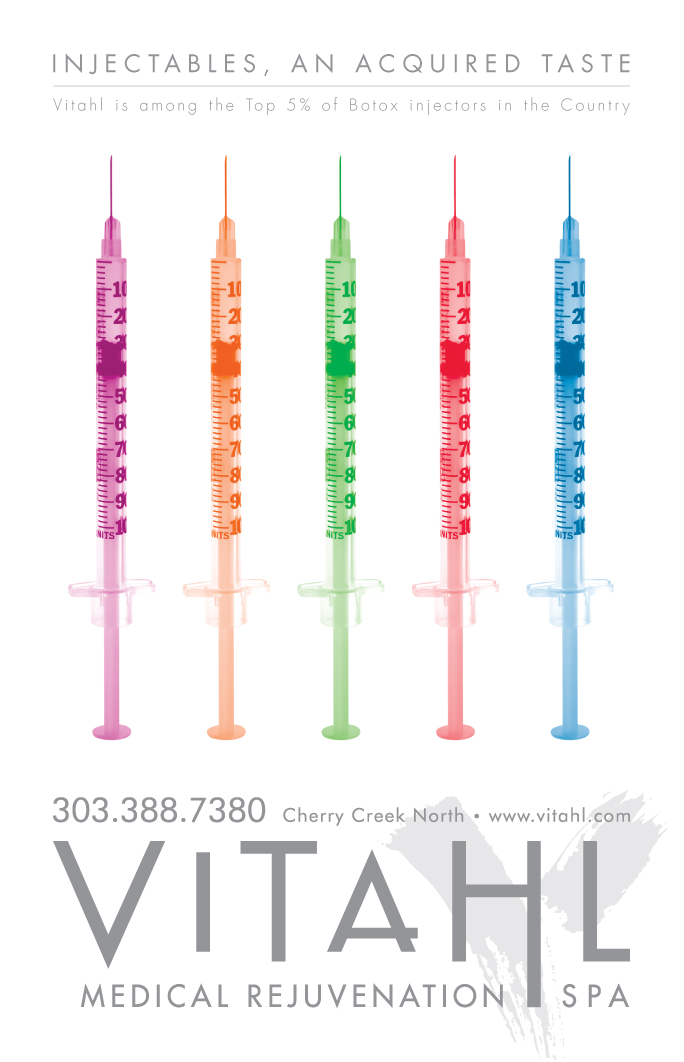
Injectables Ad
The syringes aid in engaging the viewer with shock value, while bright colors are used to convey the idea of lollipops or popsicles, reinforcing the “acquired taste” tagline, while lending a playful and less intimidating quality to injectables.
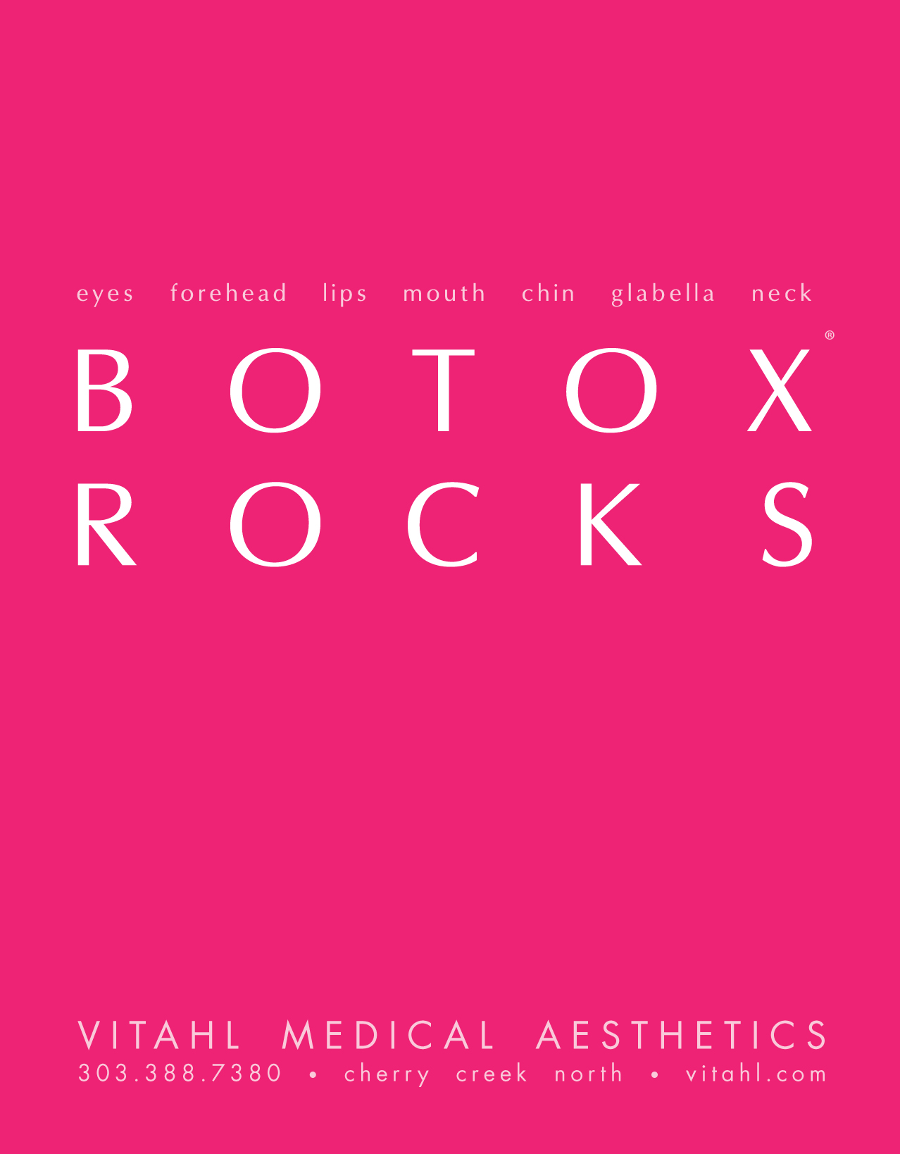
Botox Ad Campaign
This ad campaign was developed to minimize the notion that Botox is a treatment for aging. The catchy tagline, simple message and color choice resonates with a younger clientele while conveying a message of youthfulness to someone that is a bit older. Its playfulness takes the seriousness out of a procedure for preventing aging.
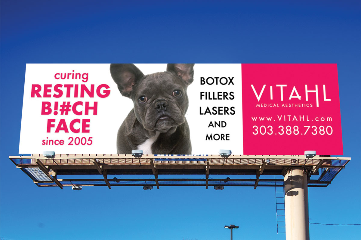
Resting B!#CH Face Billboard
This concept utilizes the phrase “Resting B!#ch Face” in a comedic way. It sends the message that Vitahl’s treatments will remove your wrinkles and therefor your RBF. A dog with wrinkles was used instead of a woman to soften the message.
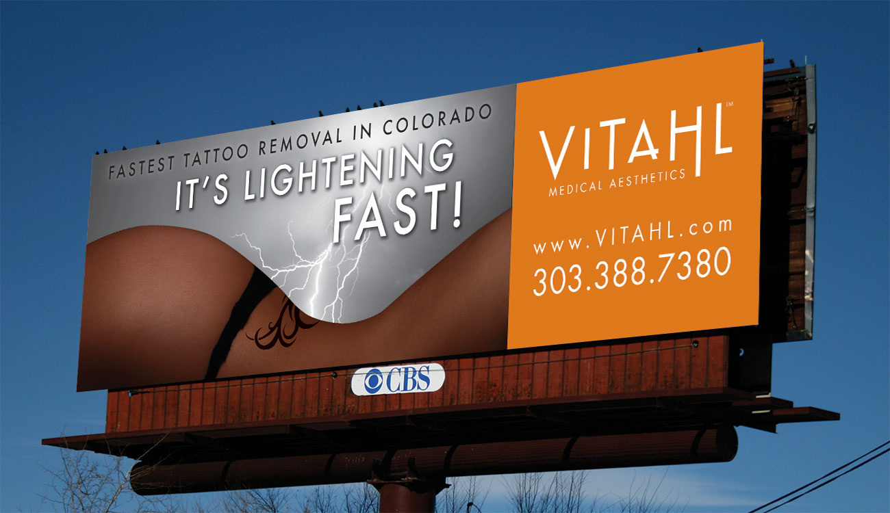
Tattoo Removal Billboard
I was asked to create an ad using the tagline “It’s Lightening Fast”. I decided to depict a hilly landscape using a female body with a lower back tattoo. Then, I illustrated lightening in the sky above striking the landscape and the tattoo.


Aesthetic Office Visit Ad
I was presented with the headline “Redefine Your Doctor Visit”. For impact, I chose to feature a syringe. To contrast the negative feelings associated with a syringe, I added happy and playful graphics exiting the syringe.


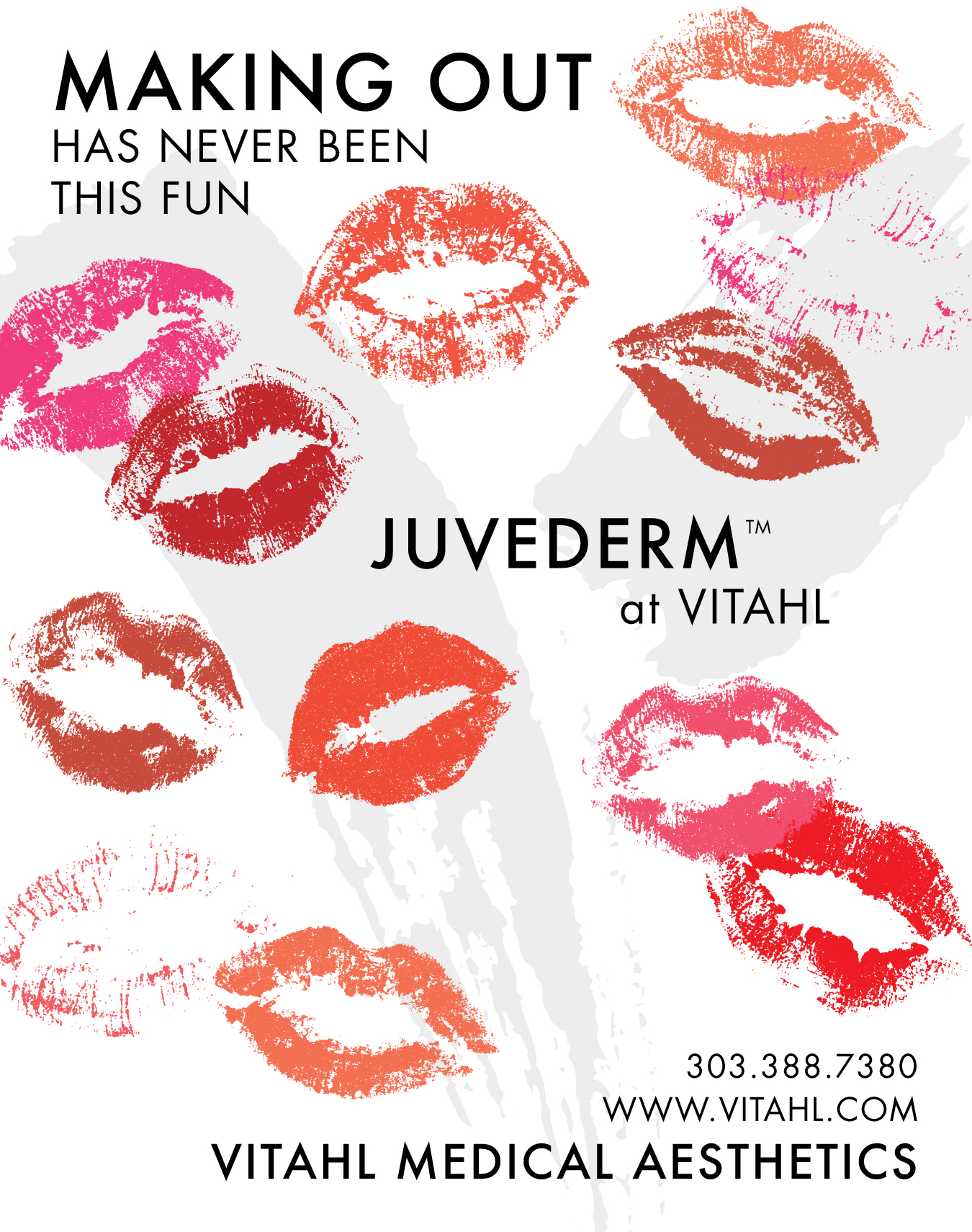
Lip Injection Ad
This design with varying colors of lipstick kisses, conveys a flirty, provocative message meant to catch the customer’s attention and lessen the historically serious feelings associated with injectables.
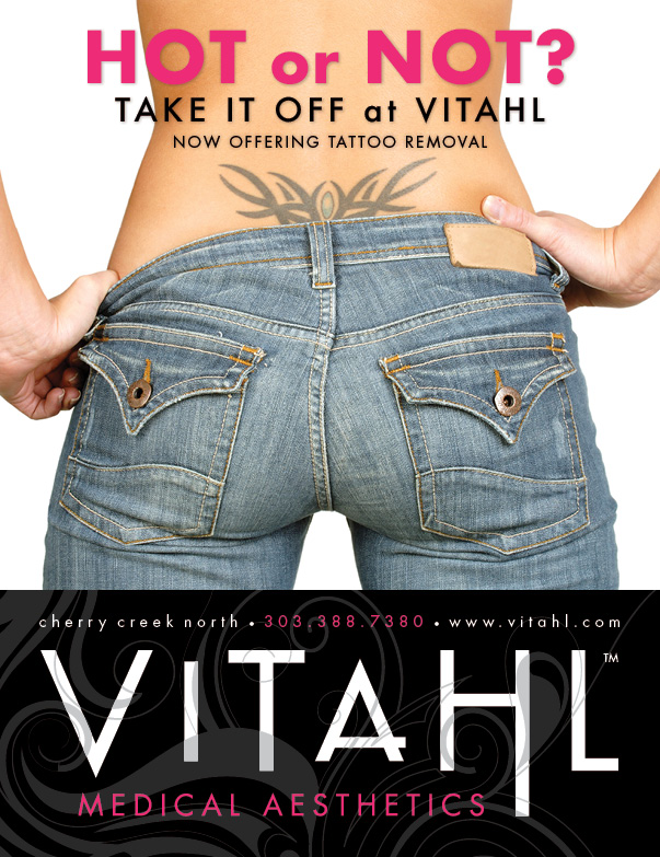
Tattoo Removal Ad Campaign
To complement this catchy headline, I chose a provocative photo of a lower back tattoo and a woman’s back side.
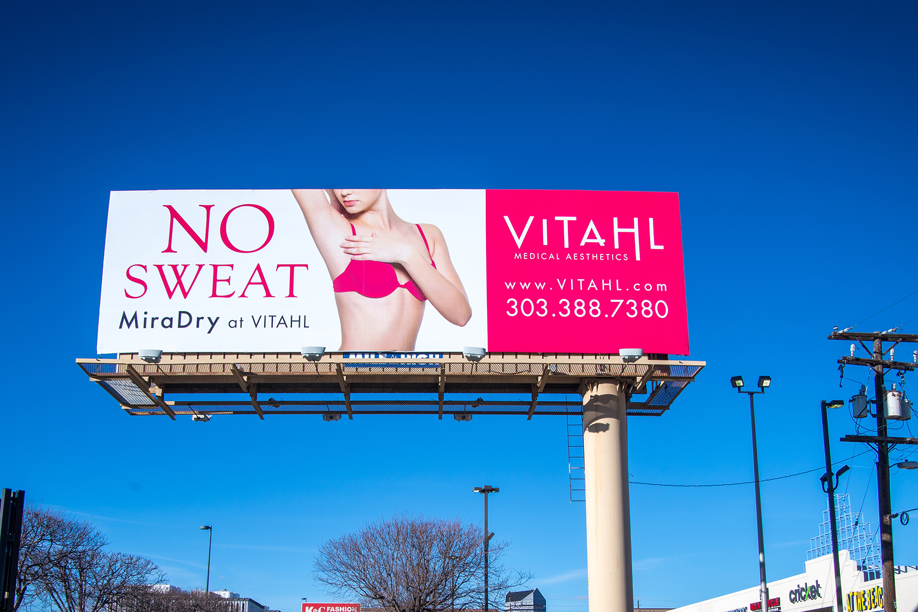
MiraDry Billboard
This billboard aligns with Vitahl’s Familiar Phrases ad campaign. The design is simple, clever and bright. Perfect for a billboard!
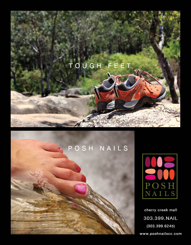
Nail Salon Magazine Ad
This ad was featured in local Colorado magazines. The concept appeals to Colorado’s active women. The story reveals manicured nails after removing hiking shoes in conjunction with a clever tagline. The natural setting reinforces Posh Nails’ spa like atmosphere.
Nail Salon Magazine Ad
I decided to arrange the nails, featured in the logo, in a botanical formation, highlighting the salon’s spa like atmosphere, while creating an interesting design that would stand out amongst other magazine ads.
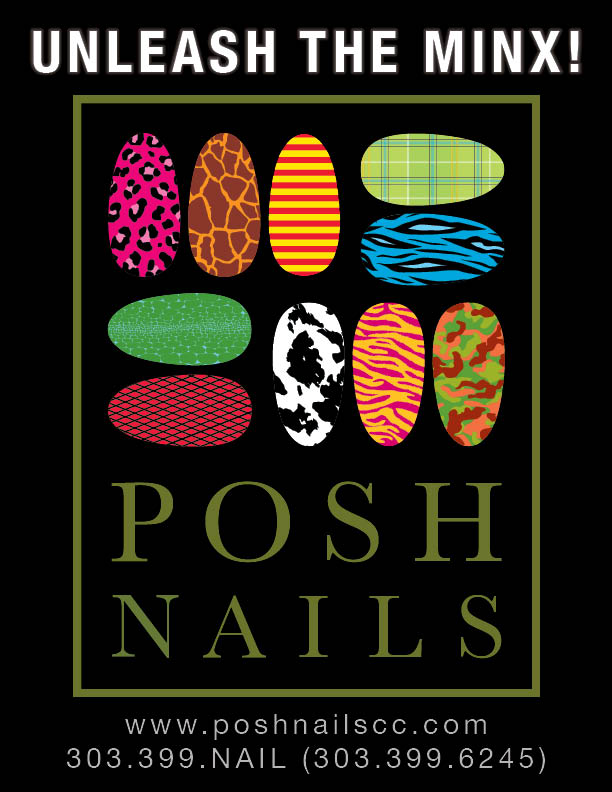
Minx Nail Polish Ad Campaign
Minx is the brand name of a long lasting printed stickers product applied to the nails in a salon. I modified the Posh logo by overlaying several eye-catching Minx nail textures onto the logo’s fingernail graphics. This communicates the product purpose as well as illustrates the product offering at Posh Nails salon.
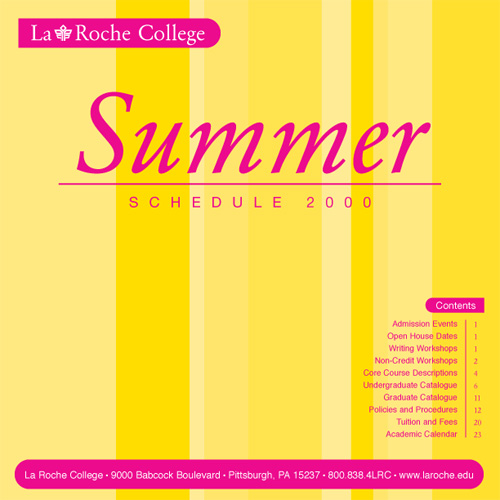
College Summer Schedule
I chose to add a fresh and fun feeling to a usually sterile document by implementing appropriate bright colors and simple design elements.
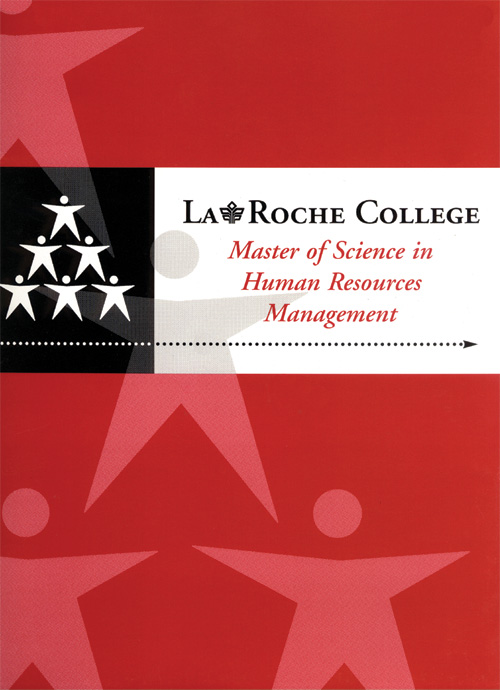
College Program Information Folder
I chose to utilize the powerful logo as the emphasis of the design by doubling the image and intergrating it into the background. The folder was printing with metallic inks to add prestige to the program.
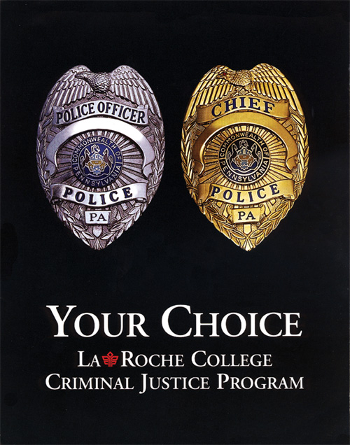
Criminal Justice Program Ad Campaign
These posters were placed in police stations and used to encourage police officers to continue their education. The concept features an officer’s badge and the gold chief’s badge, and then presents the idea of “your choice”.

Album Cover
I developed this artwork as a digital representation of traveling underwater, reinforcing the “deeper” title of the album.
Hair Salon Business Cards
Through color, these business cards give each stylist an opportunity to express their individuality while still adhering to the business’ brand. The graphic was designed around the business’ logo and represents rings around a planet. This ring design allowed me to create color palettes to represent different personalities.

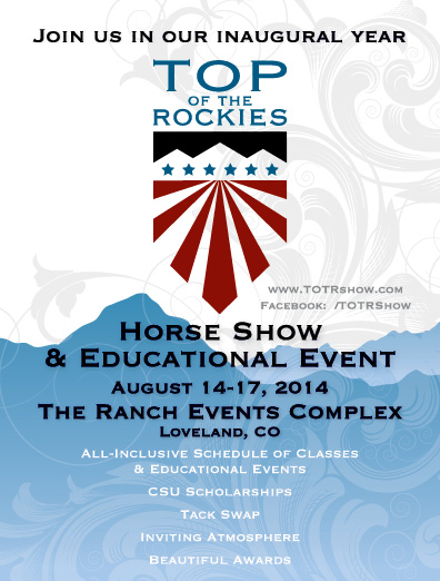
Horse Show Promotional Ad
The mountains not only reflect the location of the show, but also the power and strength that horses posses. The screened floral design is a portrayal of the filigree that is carved into leather saddles which represents the wind in the Rocky Mountains. The design has a masculine feel with feminine elements which encompasses the strong and powerful yet refined and elegant characteristics of a horse show.
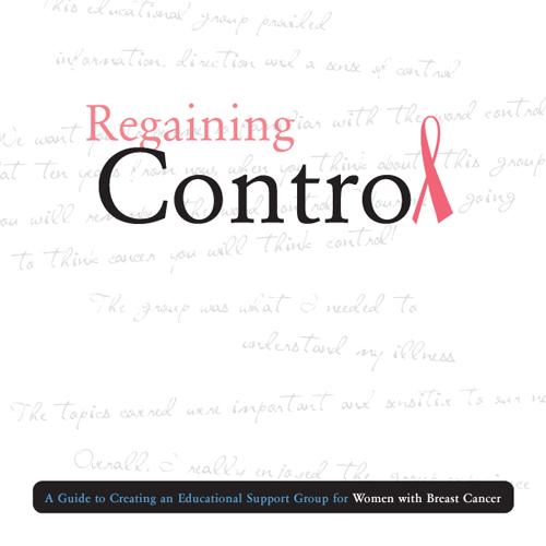
Breast Cancer Support Guide
By using a pink ribbon in place of the L in “control”, the title is unmistakably associated with breast cancer. As a background texture, I chose to add quotes written by women associated with breast cancer in a script font to convey the personal and positive side of breast cancer.

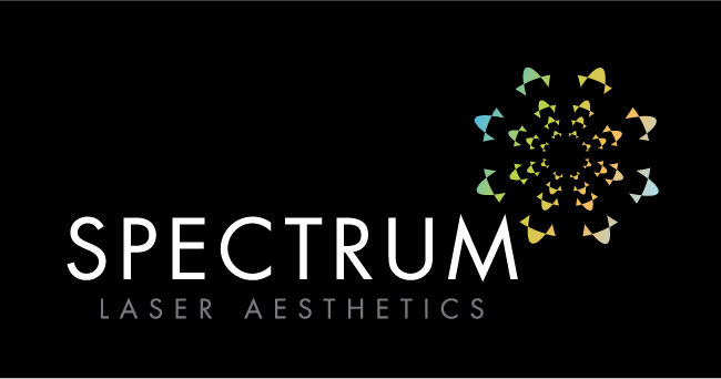
Spectrum is a laser center that provides an array of treatments including tattoo removal, laser hair removal, teeth whitening and more. The icon uses the negative space within a crystal to create a “spectrum” of light. The color scheme is comprised of soothing colors to minimize the idea of pain associated with lasers.
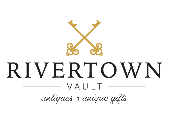
Rivertown Vault is an antique and gift shop located in a small river town in Pennsylvania. Conveying sophistication, I chose antique keys arranged in a classic layout. The concept of keys speaks to the vault aspect of the name. In contrast, for a bit of playfulness, I used a key hole instead of a bullet point in the description text.
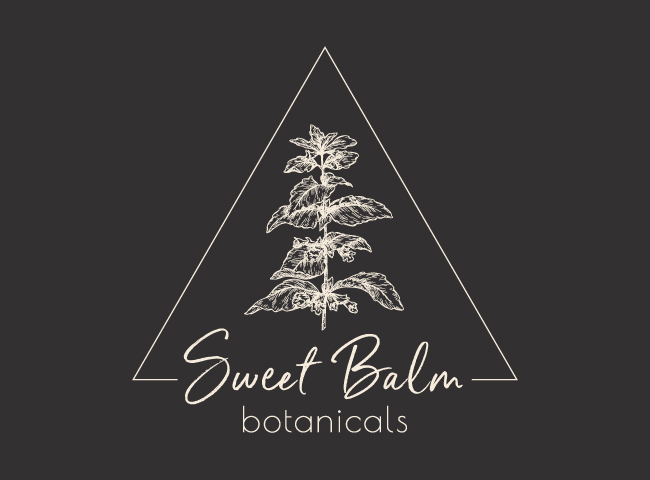
A single Sweet Balm plant is illustrated in a style resembling etching or lithography referencing old botanical guide books. This style exhibits a time-honored and significant appearance. A simple thin-lined triangle around the illustration adds a modern / art deco quality to the logo conveying current relevance. The fonts are personable yet professional.
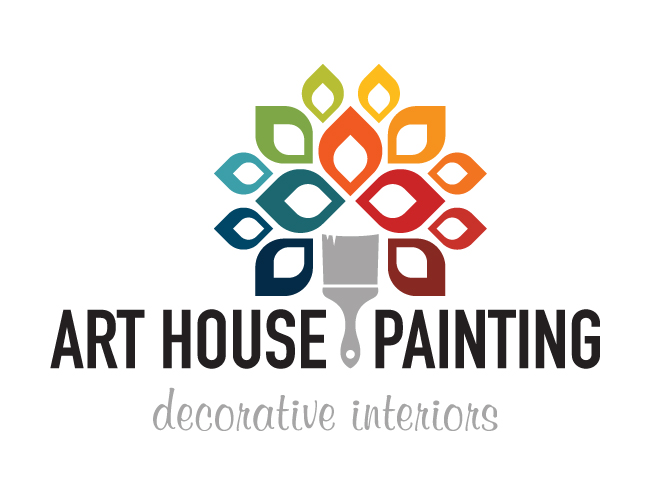
Art House Painting offers specialty painting and decorating services as well as color consultation. The logo represents a tree using a paintbrush as the trunk. The tree is bursting with a rainbow of colors and depicts the available creative painting styles.
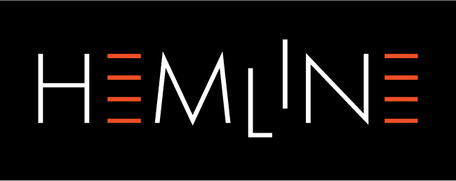
Hemline is an American pop/rock/indie band. I used 4 lines to represent different hemline lengths. The negative space between the lines forms an E. I decided to shift the L downward and the I upward to provoke a bit of disorder, lending itself to a less structured and more rock n’ roll quality.
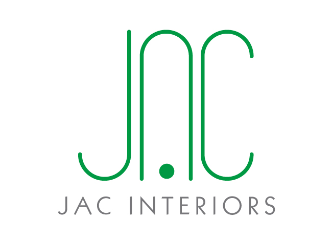
JAC Interiors is an LA-based boutique interior design firm. Using the first letter of each firm member’s name, I created a sleek and contemporary logo that would stand the test of time. I developed the logo by employing basic elements of design with only lines and circles to create each letter. Thin, consistent lines and curves were used to convey elegance and order. The long, tall character height was used to represent strength and stability.
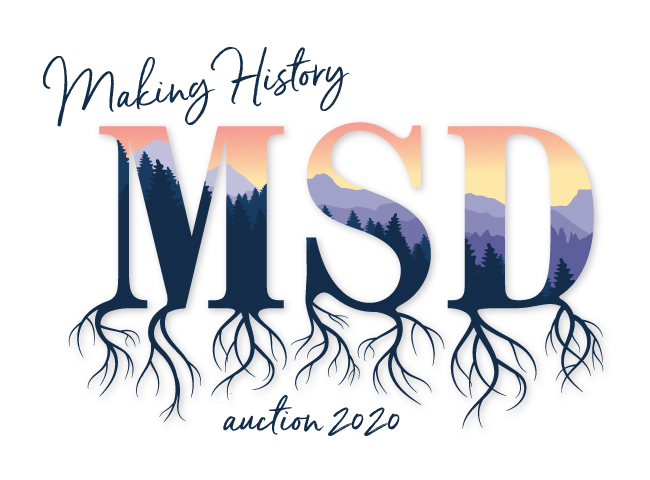
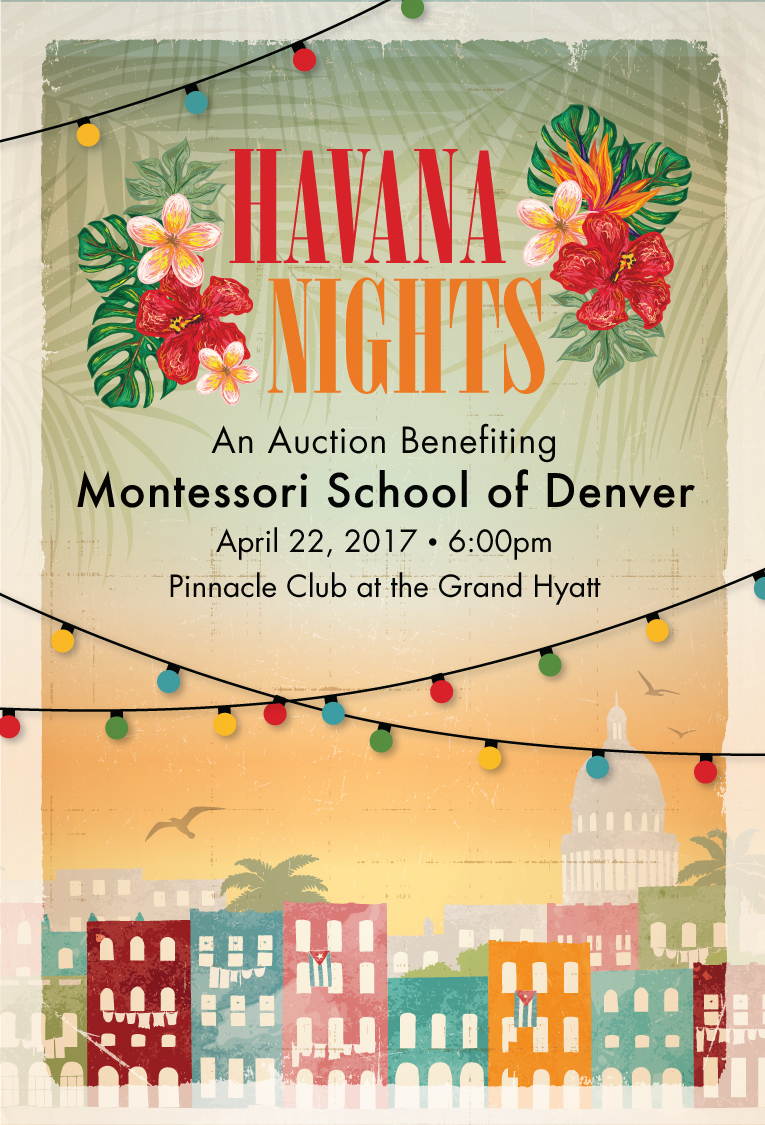
The theme for this auction was Colorado History. The yearly theme for the Montessori School of Denver was roots. I masked a Colorado mountain evening with the school’s initials and added roots to support both themes.
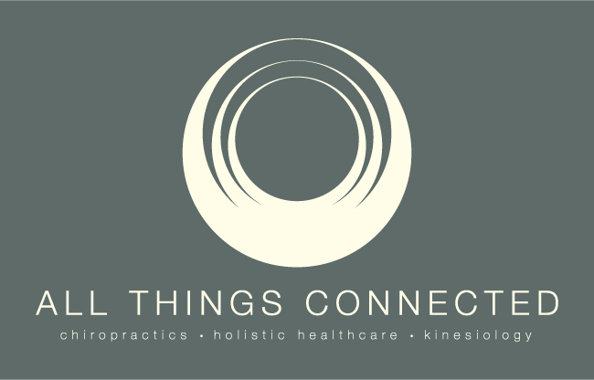
All Things Connected is a chiropractic, holistic healthcare and kinesiology practice. Because the icon is comprised only of concentric circles, it is simplistic and contemporary. The concentric circle conveys eternity because it has no end or beginning and is always connected. Layering the circles graphically creates the look of human hands connected above a head. The icon is also floral in appearance, symbolizing the holistic aspect of the practice.

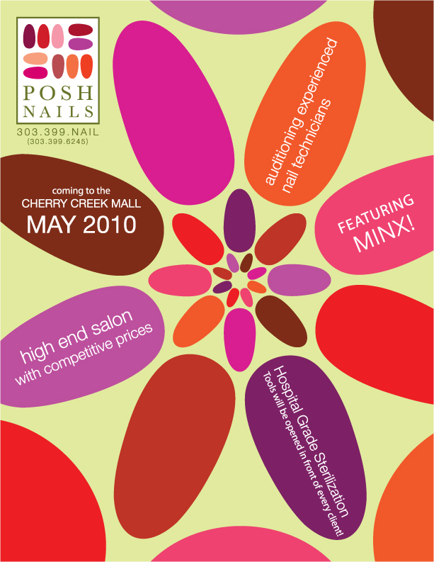
Posh Nails is a nail salon in Denver, CO that prides itself on its spa like atmosphere. The logo is comprised of fingernails arranged like pebbles in a zen garden. The color are representative of the warm, calm and natural elements of the nail spa.
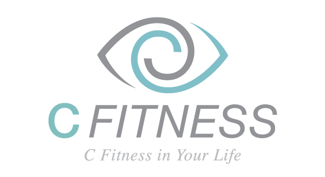
C Fitness is a private, boutique-style personal training gym. The C in the name is the first letter of the owner’s name. I chose to create a play on the word “see” by incorporating the letter C into a graphic eye. The eye has movement and strength and represent foresight.
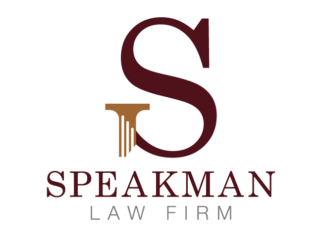
I manipulated the serif on the bottom of the “S” into a column conveying strength and stability as well as representing an element commonly found in court house architecture. Sophisticated colors reinforce the quality and professionalism of the firm.
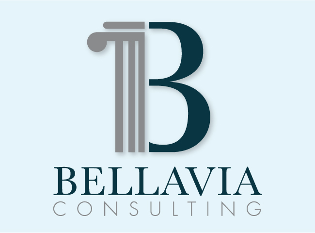
Bellavia Consulting is a private practice law office. The B is a capital letter and incorporates a column into its form, conveying strength and stability as well as exhibiting an architectural element commonly found in court house architecture. Sophisticated colors reinforce the quality and professionalism of the law office.
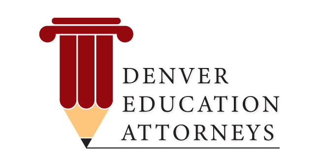
I combined a tradition symbol for education with a traditional symbol for law. The column represents strength and stability.
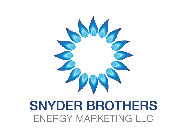
Snyder Brothers Energy markets gas supplies to gas companies. The logo is a graphic sun comprised of gas flames. The sun represents natural energy, while the blue gas flames are commonly associated with natural gas.
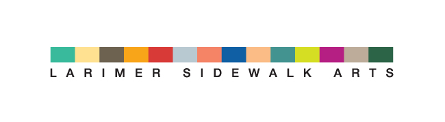
Larimer Sidewalk Arts was a Denver nonprofit organization with the mission of creating outdoor art shows for kids and young adults from families in need. The icon I created is a depiction of a sidewalk using a large array of playful colors meant to represent the diversity in artists and art available at the shows.
This logo was designed as the identity for a fundraising fashion show benefiting the GLBTC (Gay, Lesbian, Bisexual, Transgender Center) of Denver. The theme of the fashion show was Transgender. The logo illustrates the sexual and human elements of the fashion show theme by exhibiting suggestively parted lips. The Transgender element is represented by one mouth displaying two genders.

Thompson & Company is a classy and stylish hair salon. The logo is comprised of a classic font. I was able to convey the edgy quality of the salon by simply rotating the ampersand on its side.
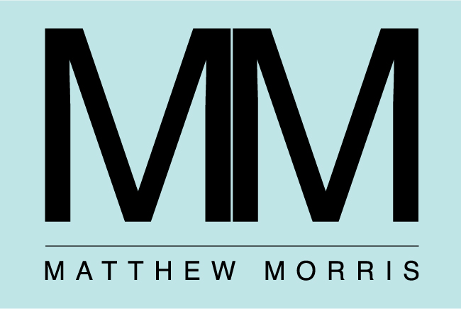
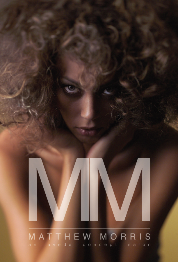
Matthew Morris is a chain of upscale salons located in Denver, CO. Matthew wanted a simple logo that would stand the test of time using his initials.
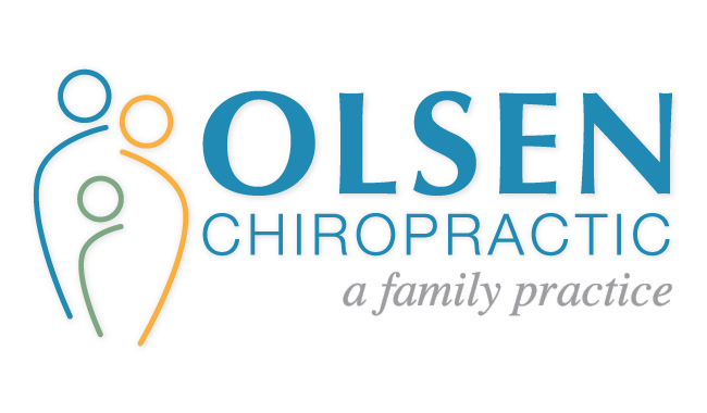
Olson Chiropractic specializes in pediatric chiropractic care. The logo represents a family, its members characterized graphically by a simple circle for the head and a curved line for the spine, both of which are body parts that are commonly associated with chiropractic care.
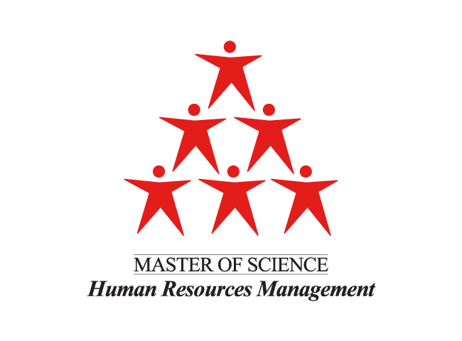
The HRM program at La Roche College allows students to develop coaching skills and learn business principles and management techniques. By stacking the human elements, the logo portrays growth, support and organization. The human figures are positive in nature because they are symbolic of stars. The figures are not gender specific which equally appeals to men and women.
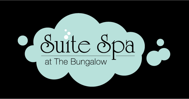
Suite Spa is a business built around the idea of spa parties. The logo was designed to look light and “sweet” with blue bubbles to represent the luxury and indulgence of a pedicure or bubble bath experience, while also depicting the lightness of a cloud. The white bubbles, which illustrate the dot over the “i”, represent champagne bubbles and general effervesce, invoking the feeling of relaxation and fun.
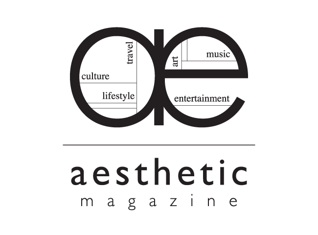
Aesthetic Magazine was a free Denver and Boulder, CO magazine. Aesthetic Magazine’s content included culture, lifestyle, travel, art, music and entertainment.
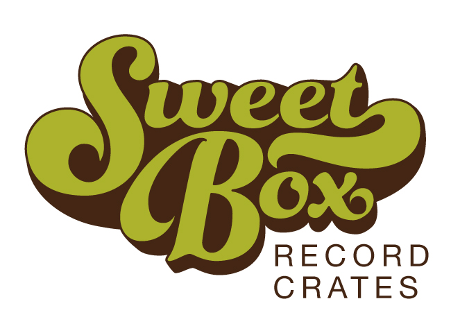
I designed the logo for Sweet Box Record Crates in the style of 1960’s and 70’s psychedelic music poster art, when vinyl records were the standard form of music listening. I also used muted colors that were popular during that time.
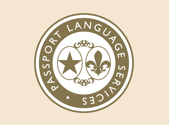
Passport Language Services is an interpretation and translation service, providing translations from English to French and French to English. The logo mimics a passport stamp and was designed to be modified according to the spoken language of the customer. If the customer is French speaking, the Fleur de lis can be placed in the left oval. If the customer is English speaking, the star can be placed in the left oval.
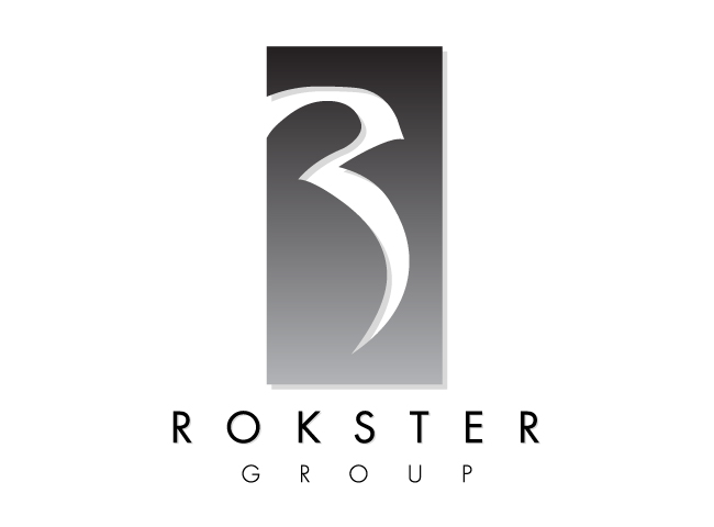
Rokster Group offers property development, sales and marketing for real estate. A stylized R is knocked out of a rectangle providing visual interest. The rectangle is tall and thin resembling the strength and power of a skyscraper.
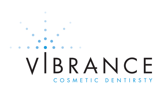
Vibrance is a cosmetic dentistry practice offering teeth whitening, porcelain veneers and dental bonding. The star formation represents light and sparkle. The gradation from dark to light represents the process of teeth whitening. Using all capital letters exhibits significance amid the contemporary font manipulation.
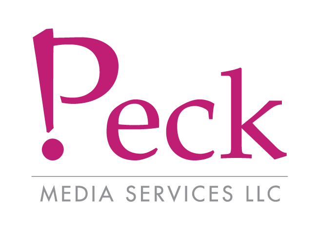
Peck Media Services is a freelance media service company. I manipulated the ‘P’ in Peck to include an explanation point to invoke a strong presence while representing the exuberant nature of the employees at Peck Media Services.
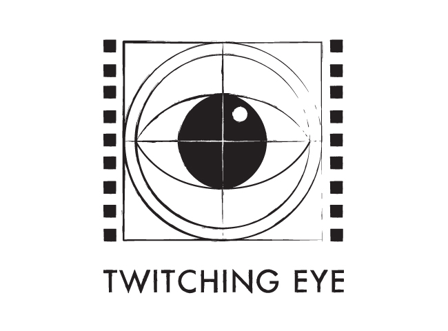
Twitching Eye was a film studio focusing on independent and short films. The logo has an eye superimposed into an old time film countdown. Old film tended to twitch, therefore reinforcing the name of the studio. The rough texture of the logo provides the feeling of an independent character.

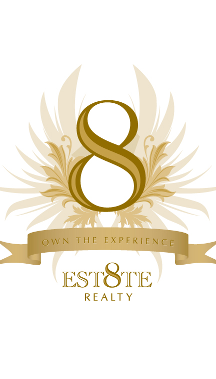
Est8te Realty is a Nevada based business specializing in high-end properties and offering unique, client focused realty services. The wings convey flight, forward momentum and optimism. I choose hues of gold to evoke a high-end presence as well as reflect the Nevada landscape.
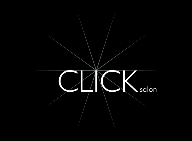
The star burst symbolizes the light cast by a flash during photo shoots and runway shows. This logo conveys a range of emotions while remaining simple and modern.

Highland Park Business District is a small and quaint business district located in Highland Park, Pittsburgh, PA. All of the displayed images represent a forceful aspect of the Highland Park Business District. The human element of the logo has joined hands representing a strong sense of community. The three wavy lines amid a blue background symbolizes the three rivers of Pittsburgh and the large reservoir that resides in Highland Park. The column depicts the two large columns present at the entrance of the public park located in Highland Park. The yellow sun represents energy, happiness and optimism.
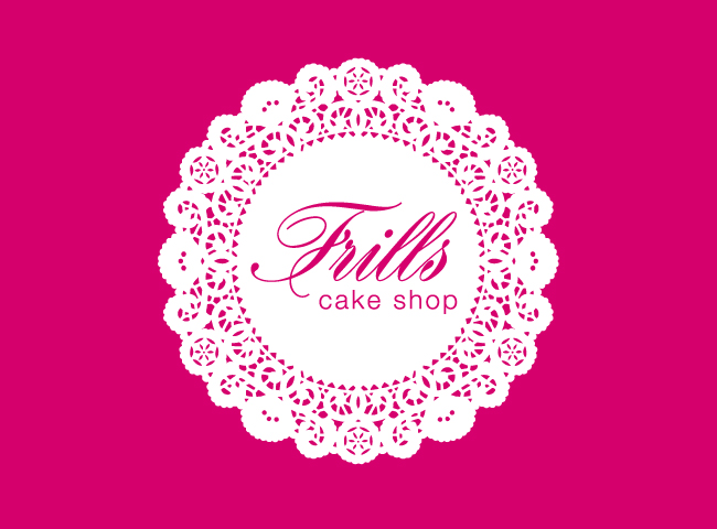
I created the Frills Cake Shop logo by knocking out the name of the business from the center of a “frilly” doily, which are traditionally placed under cakes and other sweets. I chose a mature hue of pink to enhance the “frilly” vibe of the cake shop without invoking an immature feel that can often be associated with pink.